I Can't Read This! - A Short Guide to Good Practice
From time to time Stardraw Design 7 users contact us with a common observation and request which can be summed up as "I can't make out the detail and/or text in my drawing. What can I do to make it more legible?"
In the majority of cases the problems with legibility boil down to one thing - layout - so with this article we hope to provide some guidelines and tips so that all SD7 users can get the very best results.
To illustrate best practice we will use a real-world example submitted by a Stardraw Design 7 user - names will be omitted to protect the innocent! - and we'll explore what elements can be improved to enhance legibility. It should be noted, though, that good technical drawing is not an exact science; there are 'rules' or guidelines but, like driving a car, even though we all have the same tools at our disposal, some people are just better at it. With practice and instruction, however, everyone can improve.
These screengrabs show the original drawing first and, second, an improved version that respects the symbols and design intent of the original but applies best practice where possible.
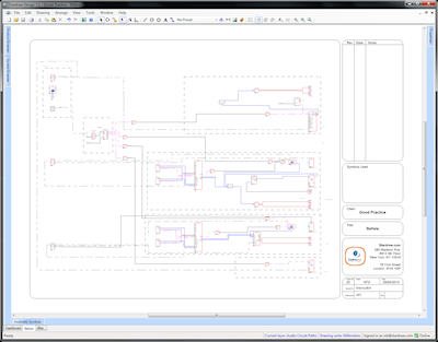
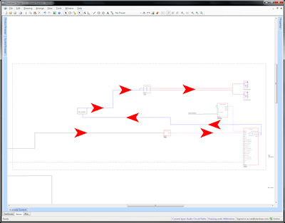
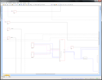
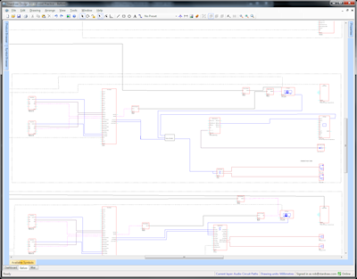
Original Drawing
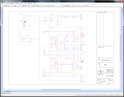
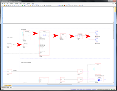
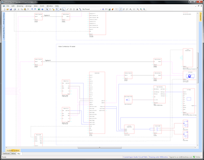
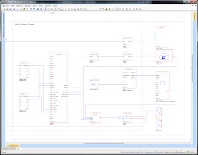
Modified Drawing
What's wrong with the original?
Well, 4 classes of problem are immediately apparent:
- The sometimes random positioning of symbols mean that it's jumbled and hard to make out the logic of the signal flow.
- Symbols are spaced unnecessarily far apart and as a result, to fit onto a given page size, things become smaller: text is harder to read and connections are harder to follow. It's a failure to optimize 'white space'.
- The signal paths have more twists and turns than they need, sometimes running back on themselves and creating a 'maze' effect.
- Not enough attention has been paid to keeping things exactly horizontal and vertical and evenly spaced. This creates a messy layout which in turn is hard on the eye.
What are the principles employed in the improved version?
1) Ordered Layout: use columns to arrange the symbols; if there are 4 stages in the signal path, have 4 columns. If there are 8 stages, use 8 columns. Where possible, align units with similar functions in the same column, e.g. put all the power amplifiers in the penultimate column, and all the 'destination' or 'endpoint' devices, like speakers, projectors and monitors, in the last column. The column offset is up to personal preference but, except where devices have dozens of connected inputs or outputs, a horizontal distance of 30 grid points between the left edge of symbols usually works well.
Original Drawing: random positioning (with green lines added to show left edges of symbols)
Modified Drawing: orderly columns (with green lines added to show left edges of symbols)
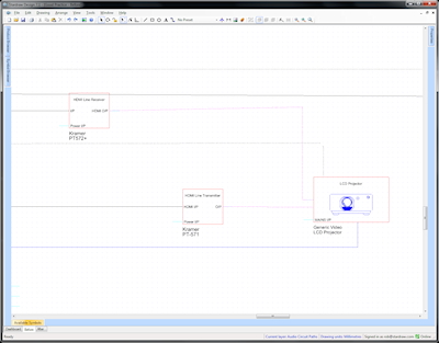
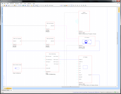
2) Run Signals Left to Right. Input devices should be on the left, output devices on the right, and the signal flow should, wherever possible, go left to right. In some cases it is necessary for an output to go back to a device in an earlier column but this can and should be minimized; don't run right to left unless it's absolutely necessary.
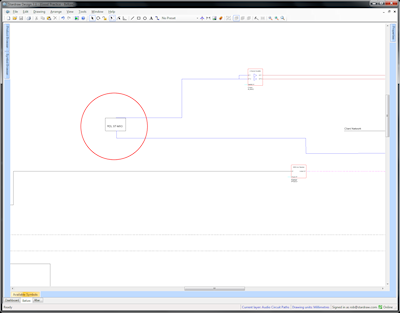
Original Drawing: reversed signal flow
Modified Drawing: coherent signal flow
3) Consistent Symbols. All symbols have come from the Stardraw library or been generated using the User Defined Product Wizard. This means that the right size, shape, colors, IO stubs and symbol practices are maintained throughout the whole drawing; nothing stands out as strange or 'not belonging'.
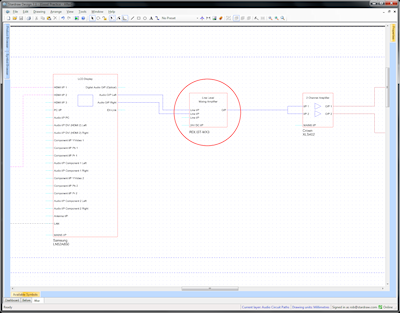
Original Drawing: inconsistent symbols
Modified Drawing: consistent symbols
4) Even Spacing of Interconnections. Wherever possible use the same spacing, e.g. 2 gridpoints, between cables; this makes signal paths much easier to follow and just looks neater. Even spacing is particularly important for adjacent lines that run vertically.
Original Drawing: random cable spacing
Modified Drawing: consistent cable spacing
5) Use the Grid. Keep symbols and cables on the grid at all times; it aids even spacing and ensures that cables and alignments stay exactly horizontal or vertical. If things come off the grid it is impossible to keep things neat.
Original Drawing: symbols and cables off-grid
Modified Drawing: everything on-grid
6) Simplified Routing: for Cables, we have as few segments as possible, avoiding unnecessary changes of direction. The fewer segments a Cable has, the easier it is to follow its routing.
Original Drawing: complex routing
Modified Drawing: simplified routing
7) Optimize White Space. We avoid putting in too much white space, at the same time taking care not to bunch things together. By optimizing the white space the symbols in the improved version appear to be about twice the size when output to any given page or screen size and this is the single greatest enhancement in text legibility. Consider the longest axis of the drawing so that if a drawing is taller than it is wide, concentrate on minimizing vertical white space. If it's wider than it is tall, optimize horizontal spacing. These optimizations also determine or depend on whether it will be output in portrait or landscape orientation.
Original Drawing: poor use of space and layout
Modified Drawing: optimized layout
8) Know when to break the rules. Significant improvements in terms of layout can sometimes be achieved by a small breach of the standard rules. For example, if you can save a lot of height or width of the overall drawing by putting a couple of extra turns in a small number of cables to re-position a whole section of the drawing and optimize space, do it!
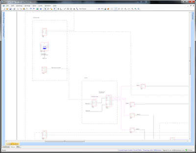
Original Drawing: left-to-right rule eats up space
Modified Drawing: bends one cable to gain space
Tips and techniques to achieve best practice.
- Work Backwards. In most AV systems there are usually more output devices than input devices. The last column (the output devices) is likely to be the tallest so start with that to understand the size of the critical (longest) axis in the completed drawing.
- Use Construction Lines. It can be helpful to put in temporary lines that assist in alignment and spacing. Use the Line tool with a conspicuous color, not elsewhere used, in conjunction with Orthogonal Lock to ensure your construction lines are exactly horizontal or vertical. Delete these lines when you no longer need them.
- Respect the Grid. Always work with Snap to Grid on. If for some reason a symbol has come off the grid, rightclick on it and select Align Origins to Grid. Make sure that all your Cable nodes sit exactly on Gridpoints to make alignment and spacing easy.
- Use Align tools. In large drawings you can quickly ensure your symbols are perfectly arranged in columns by choosing Arrange | Align | Lefts.
- Reduce Cable Segments. When creating Cables, don't use 3 segments when 1 will do. Don't use 5 segments when 3 will do. If a Cable has more than 5 segments then something is very wrong. Move symbols around to ensure that you can document Cables with as few changes of direction, i.e. as few segments, as possible.
By following these guidelines and employing best practice techniques the product of your drawing activities will be easier to read, look more professional, and the time spent generating drawings should be greatly reduced. Happy drawing!
Kind regards,
Rob Robinson
Stardraw.com